

Patika App v1.0
Research-led Educational SaaS Design
Patika is a speech and language app for children aged 4 to 8, built to attract investment and licensing to schools. I led design and research. Two studies, 32 respondents: 75% of parents and educators had never used a language app before; during expert testing, specialists named voice and question-answer exercises as the highest-value features without prompting
4 min read
SCOPE
END-TO-END PRODUCT DESIGN
USER RESEARCH & SYNTHESIS
NAVIGATION & VISUAL SYSTEM
PROTOTYPE TESTING
ROLE
PRODUCT DESIGNER
UX RESEARCHER
MOTION DESIGNER
TOOLS
FIGMA
ELEVEN LABS
JITTER
FORMS

01
THE PROBLEM
A speech-language pathologist came with a 400-page clinical book for children aged 4 to 8 with Autism Spectrum Disorder (ASD) and Speech and Language Disorders (SLD). They wanted it turned into an app in two weeks, then handed to engineers.
"The content had no delivery mechanism."
A book works because a clinician is holding it. Remove that person and the content needs a new mechanism to function. The question: what replaces the clinician's judgment on a screen, and how do you make a child with a language delay want to return without anyone prompting them?
"The scope was unbuildable as stated."
400 pages meant 200+ modules. Without a scalable template system, the project would never ship.
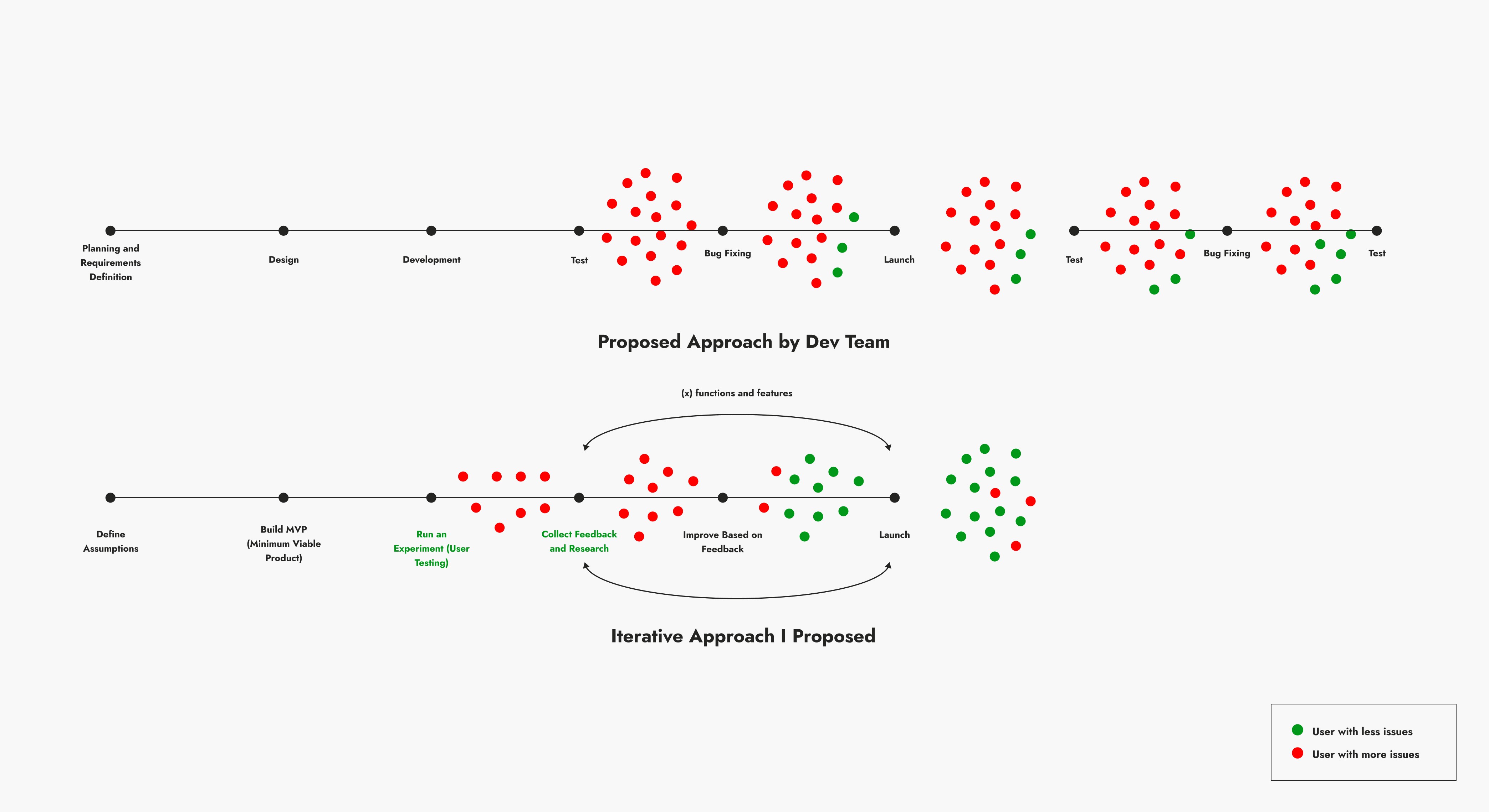
"The development approach would surface problems too late."
The instinct was to design everything first, then build, then test. For a product where untested assumptions cost real developmental time in real classrooms, that compounds errors silently. I built a diagram comparing both approaches. The client aligned immediately.
02
DISCOVERY
20 parents and educators, surveyed before a single screen was built.
15 of 20 had never used a language-development app.
- Had never used a language-development app
- Had used a language-development app
Observed demographics, prior tool use, language-development stage of the child, biggest difficulty, most-wanted features, what current tools were missing.
The signal was unambiguous. 70% of the children had a diagnosed condition. 75% had never used a language-development app. Half had only minimal tech experience. The market gap was real and the audience was tech-naive.
Difficulties split four ways: word positioning (25%), pronunciation (25%), 5W1H question answering (20%), story comprehension (20%). All four were addressed by the module structure that followed.
Three features dominated the wishlist. All three became core to the build.
Discovery survey · n=20 parents and educators
When asked what was missing in current tools, the top answer was "It doesn't capture the child's interest" (30%). The challenge was engagement, not pedagogy.
Every design decision that followed was a response to this data, not an instinct.
03
Scalability
10–15 modules engineers could scale to 200+

Same interaction logic for every module. Engineers swap content, not architecture. The core loop: a child watches a short video of two characters in conversation.
A question appears, Who is Jim? with blank gap fields. The child speaks their answer. Speech-to-text places the words in the gaps. One interaction. Two signals: can the child speak clearly enough for the system to recognize them, and did they understand the content?
Change the video, the world, the questions. The logic stays the same. That's what makes 200 modules buildable.
04
Research & Design
The motivation problem required research, not instinct.
| Mechanic | Anxiety-safe for clinical population | Fits clinical context | Low cognitive load on language task |
|---|---|---|---|
| Time pressure | No | Mixed | Yes |
| Combat | Mixed | No | Mixed |
| Resource collection | Yes | Yes | No |
| Map progression (chosen) | Yes | Yes | Yes |
5–10 game mechanic options sketched and reviewed with the client. Research and clinical fit determined the right choice — the timeline ruled out testing each separately.
Time pressure mechanics were not suitable for children who experience anxiety. Combat themes were misaligned with a clinical setting. Resource-collection added cognitive load competing with the language task.

Utilizing a map-based progression provided the strongest clinical fit, and testing validated the hypothesis that maintaining full path visibility would drive engagement and repeat usage.
Accepted trade-off: showing the full path meant showing multiple stages simultaneously. Motivational value judged to outweigh the clarity cost. Testing confirmed it was fixable.
4.1
Design decisions
The app had to work without an adult in the room.

Voice over text
Text input was ruled out, it would measure typing ability, not comprehension.

Automatic hints
Tap-to-reveal interrupted flow for children with attention challenges. Automatic surfacing removed that friction.

Simpler screens
Fewer visible options per screen was the clearest finding across all sessions. Fewer choices, faster understanding, fewer errors.
4.2
Visual system
Children needed energy. Educators needed clear data. One shared system resolved both.


05
How I Worked
Usability held. The deeper signal was workflow transformation.
With the client
No design background. Every decision communicated in clinical and business terms. Game options presented as sketches with rationale. Disagreements resolved by returning to research, not instinct.
With the graphic designer
Never met in person. Coordination through a precise visual spec; type sizes, color values, spacing, character proportion guidelines. Their output slotted in without art direction after every delivery.
With the pathologist
Regulations prevented direct observation of children. He ran all child-facing sessions. My role: design the protocol, define the measures, interpret the data.
06
Testing
12 Educators across kindergarten teachers, speech therapists, and special education specialists.

Four areas tested independently: onboarding, learning features, voice interaction (conceptual), and progress tracking. Protocol was written before testing began.
I designed the protocol. The client ran the sessions in his school setting under his professional supervision, as required by the regulations governing research with minors in this clinical population.
07
FINDINGS
Discovery to validation. Two studies, 32 respondents, one consistent signal.
- Voice recognition
- Structured language exercises
The research signal was remarkably consistent: the features requested during initial discovery were independently verified as high-value during expert testing. Without prompting, specialists identified voice recognition and 5W1H exercises as the app's most critical assets, ranking them exactly as the initial discovery data had predicted.
Centralization. 83% of educators said the app would replace the materials they currently juggle. One said: "It is not possible to get all these features from a book."
Engagement gap. 30% said current tools "doesn't capture the child's interest." The motivation architecture was designed against this before testing.
Navigation held. 92% rated it easy. Five flagged "too many options for children", a tension the map screen finding picks up.
The misread that mattered. Educators flagged the map screen as having too many options. The instinct was an IA problem. It wasn't. Only one stage was ever selectable. Active and locked stages just looked too similar. The fix is contrast, not fewer stages. In the backlog.
Screen time. 25% raised concerns. One asked for a 5 to 10 minute session timer. Onboarding already lets users cap daily sessions. The timer alert is in the backlog.
08
Reflection
What would I do differently?

Map screen state contrast
Diagnosed, not fixed. In the backlog.
Comparative mechanic testing
One mechanic chosen under time pressure. Two variants tested comparatively would have been more defensible.
Classroom XP validation
Designed but not validated in actual classroom use.
Direct child observation
Educator proxies were a regulatory constraint. Child-facing data would produce a more clinically precise picture.
Select artifacts withheld due to confidentiality. Please contact for details.
