

Hats & ladders
Product Design, UX Research & UI Design
Hats & Ladders serves 250,000+ students across 200+ organizations through game-based career exploration. When they expanded into middle schools, the student experience wasn't built for the age group and educators had no tooling to manage it. I worked on both, redesigning the student profile and building the educator dashboard from scratch. Middle school reached 1,021 students across 34 sites in one year.
3 min read
SCOPE
END-TO-END PRODUCT DESIGN
USER RESEARCH & SYNTHESIS
NAVIGATION & VISUAL SYSTEM
PROTOTYPE TESTING
ROLE
PRODUCT DESIGNER
UX RESEARCHER
TOOLS
FIGMA
OTTER AI
CHATGPT
FORMS

01
The Problem
A pilot with 35 students made three problems immediately clear.
Students couldn't log in.
The login flow assumed everyone had a school email. A lot of the middle school group didn't. They couldn't get past the first screen.
Educators couldn't find what they needed.
Lesson materials existed but weren't easy to locate. Educators were contacting support just to get started.
The app was built for a different age group.
Originally designed for young adults making career decisions. For a 12-year-old in a summer program it was overwhelming and didn't work well on the devices they were using.
Educators also had no dedicated tool. They managed students across two separate websites, wrote login instructions by hand, and submitted support requests just to see what their students were experiencing.
02
What We Built
The student app needed to feel less like a form and more like something that belonged to them. Educators needed a tool that didn't exist yet.

To address these systemic barriers, we developed a Unified App ecosystem, migrating from a fragmented legacy architecture to a single, custom-built platform.
For students, we transformed the profile from a static inventory into a mobile-first narrative focused on self-discovery.
For educators, we designed an Automated Toolkit and an intuitive 'Climber Mode'; a feature initially restricted by technical scope; that allowed them to preview the student experience instantly, eliminating the need for manual support requests
03
STUDENT APP
The first screen students saw after signing up showed their personality type, values, and a list of matched careers.

For a middle schooler it was too much, too dense, language that assumed too much, layout built for desktop.
We spoke to students, built prototypes, and ran tests. Four things changed:

Compressed the layout so students saw only what was relevant at first contact. The original screen asked middle schoolers to process career planning information they had no context for yet.
Hierarchy
Reordered key elements around Z-pattern scanning. Younger users don't hunt for information. It has to be where they look first.
Mobile
Narrowed content widths and increased tap target sizes for the phones and Chromebooks the cohort actually used. The original layout was designed for desktop.
The metric
Changed the internal success benchmark from time-on-platform to students successfully onboarded. Engagement time was the wrong target for an expansion cohort where first contact mattered most.

One gap: the youngest students struggled to connect their personality results to specific careers. It worked for most. The youngest group became a documented problem for the next round.
Post-launch survey RESULTS, 2023
85%
75%
5-10%
3.9/5
04
EDUCATOR TOOL
Nothing existed before this. We built a single tool to replace two separate websites; one login, all student groups, progress tracking, and lesson materials in one place.

Initial state.

Returning state, last session surfaced in hero.
One login replaced two separate websites. All groups in one view.
Progress tracking
Assessment completion and progress visible per group and per student.
Automated onboarding
Login instructions that used to be written by hand now generated automatically.
Implementation materials
Lesson plans, topic guides, and professional development resources accessible from the same tool.

The feature we're most proud of wasn't in the original plan. Getting educators to preview the student experience used to require a support request and days of waiting.
We built a way to do it directly from the educator tool; one button in, one button out, no extra login. It was marked as too complex. We built it anyway.

The preview panel. Educators enter the student experience from here; no separate login, no support request.
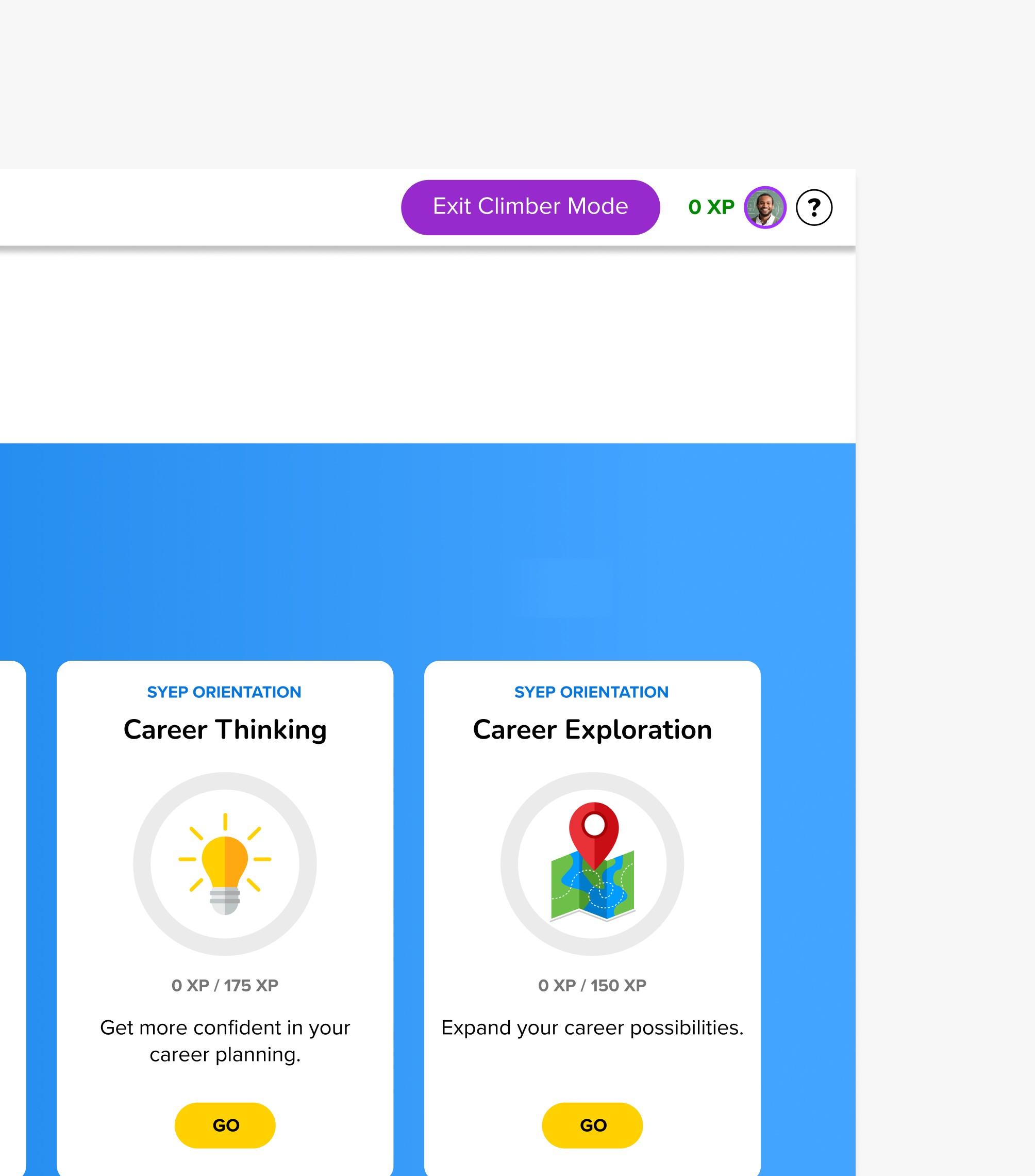
Inside the student experience. Exit Preview returns the educator to their dashboard in one click.
Every educator we tested it with figured it out without any guidance.
Cut from scope as too complex
Built and shipped anyway
9 of 9 educators tested passed without instruction
05
HOW WE WORKED
Two surfaces, one tight window, and a role that grew along the way.
The engagement started as an internship and led to a promotion mid-way through. Working closely with a senior designer throughout, absorbing how she approached ambiguous problems while gradually taking on more ownership across both surfaces.
Two products, one window.
Small team, tight deadline tied to a fixed program start. Research, prototyping, and testing on the student side ran in parallel with the educator tool. Every decision had to hold up for two very different types of users at once.
Built what wasn't asked for.
The educator preview feature was cut from scope early. Too complex, not enough time. We scoped it, built it, tested it. It became the feature every tester used without being shown how.
06
IMPACT
The redesign worked where it mattered. Students got in, educators found what they needed, and the program grew.

Post-launch, 86% of educators felt more prepared to onboard students. 73% said tracking progress was easier. The structure held. Some onboarding steps needed refinement and were logged for the next cycle.
Feedback after launch defined the next problem. Educators managing many groups needed cross-group reporting and search. First version solved single-group management. Many groups at once was next.
Select artifacts withheld due to confidentiality.
Designed at HATS & LADDERS
https://hatsandladders.com/
